(FontAwesome) CSS3 Text Animation
Text Animation CSS and FontAwesome
- Import font-awesome from cdn -> https://cdnjs.cloudflare.com/ajax/libs/font-awesome/4.7.0/css/font-awesome.min.css
- CSS:
@import url('https://fonts.googleapis.com/css?family=Anton|Roboto');

.word {
 font-family: 'Anton', sans-serif;
 perspective: 1000px;
 perspective-origin: 200px 40px;
}

.word span {
 cursor: pointer;
 display: inline-block;
 font-size: 100px;
 user-select: none;
 line-height: .8;
}

.word span:nth-child(1).active {
 animation: balance 1.5s ease-out;
 transform-origin: 0% 100% 0px;
}

@keyframes balance {
 0%, 100% {
  transform: rotate(0deg);
 }

 30%, 60% {
  transform: rotate(-45deg);
 }
}

.word span:nth-child(2).active {
 animation: shrinkjump 1s ease-in-out;
 transform-origin: bottom center;
}

@keyframes shrinkjump {
 10%, 35% {
  transform: scale(2, .2) translate(0, 0);
 }

 45%, 50% {
  transform: scale(1) translate(0, -150px);
 }

 80% {
  transform: scale(1) translate(0, 0);
 }
}

.word span:nth-child(3).active {
 animation: falling 2s ease-out;
 transform-origin: bottom center;
}

@keyframes falling {
 12% {
  transform: rotateX(240deg);
 }

 24% {
  transform: rotateX(150deg);
 }

 36% {
  transform: rotateX(200deg);
 }

 48% {
  transform: rotateX(175deg);
 }

 60%, 85% {
  transform: rotateX(180deg);
 }

 100% {
  transform: rotateX(0deg);
 }
}

.word span:nth-child(4).active {
 animation: rotate 1s ease-out;
}

@keyframes rotate {
 20%, 80% {
  transform: rotateY(180deg);
 }

 100% {
  transform: rotateY(360deg);
 }
}

.word span:nth-child(5).active {
 animation: toplong 1.5s linear;
}

@keyframes toplong {
 10%, 40% {
  transform: translateY(-48vh) scaleY(1);
 }

 90% {
  transform: translateY(-48vh) scaleY(4);
 }
}

/* Other styles */
#letters-container {
 background-color: skyblue;
 color: #fff;
 display: flex;
 font-family: 'Roboto', sans-serif;
 justify-content: center;
 align-items: center;
 flex-direction: row;
 height: 100vh;
 margin: 0; padding:0;
}

.fixed {
 position: fixed;
 top: 40px;
 left: 50%;
 transform: translateX(-50%);
}

footer {
 position: fixed;
 bottom: 0;
 left: 0;
 right: 0;
 text-align: center;
 letter-spacing: 1px;
}

footer i {
 color: red;
}

footer a {
 color: #3C97BF;
 text-decoration: none;
}
Source Css let spans = document.querySelectorAll('.word span'); spans.forEach((span, idx) => { span.addEventListener('click', (e) => { e.target.classList.add('active'); }); span.addEventListener('animationend', (e) => { e.target.classList.remove('active'); }); // Initial animation setTimeout(() => { span.classList.add('active'); }, 750 * (idx+1)) });Source JS- Html: ->
<div id="letters-container">
<h3 class="fixed">Click the letters! | klik Huruf Nama Ku</h3>
<div class="word">
 <span>D</span>
 <span>I</span>
 <span>M</span>
 <span>A</span>
 <span>S</span>
</div>
<footer>
 <p>Created with <i class="fa fa-heart"></i> by <a href="http://Web-Manajemen.blogspot.com">Dimas Lanjaka</a></p>
</footer>
</div>
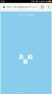
Source HTML - Result: ->


Comments
Post a Comment
Bila Ada posting yang kurang, atau error atau yang lainnya, silahkan tinggalkan komentar agar artikel/post di perbaiki.
Jangan Lupa Cek Box "Notify Me" agar tahu komentar kamu dibalas oleh saya.
If there are any posts that are missing, or error or anything else, please leave a comment for the article / post to be fixed.
Do not Forget Check Box "Notify Me" to know our comments replied by me.